Art Basel
Miami Beach
December 2 – December 6, 2020
Head-Image


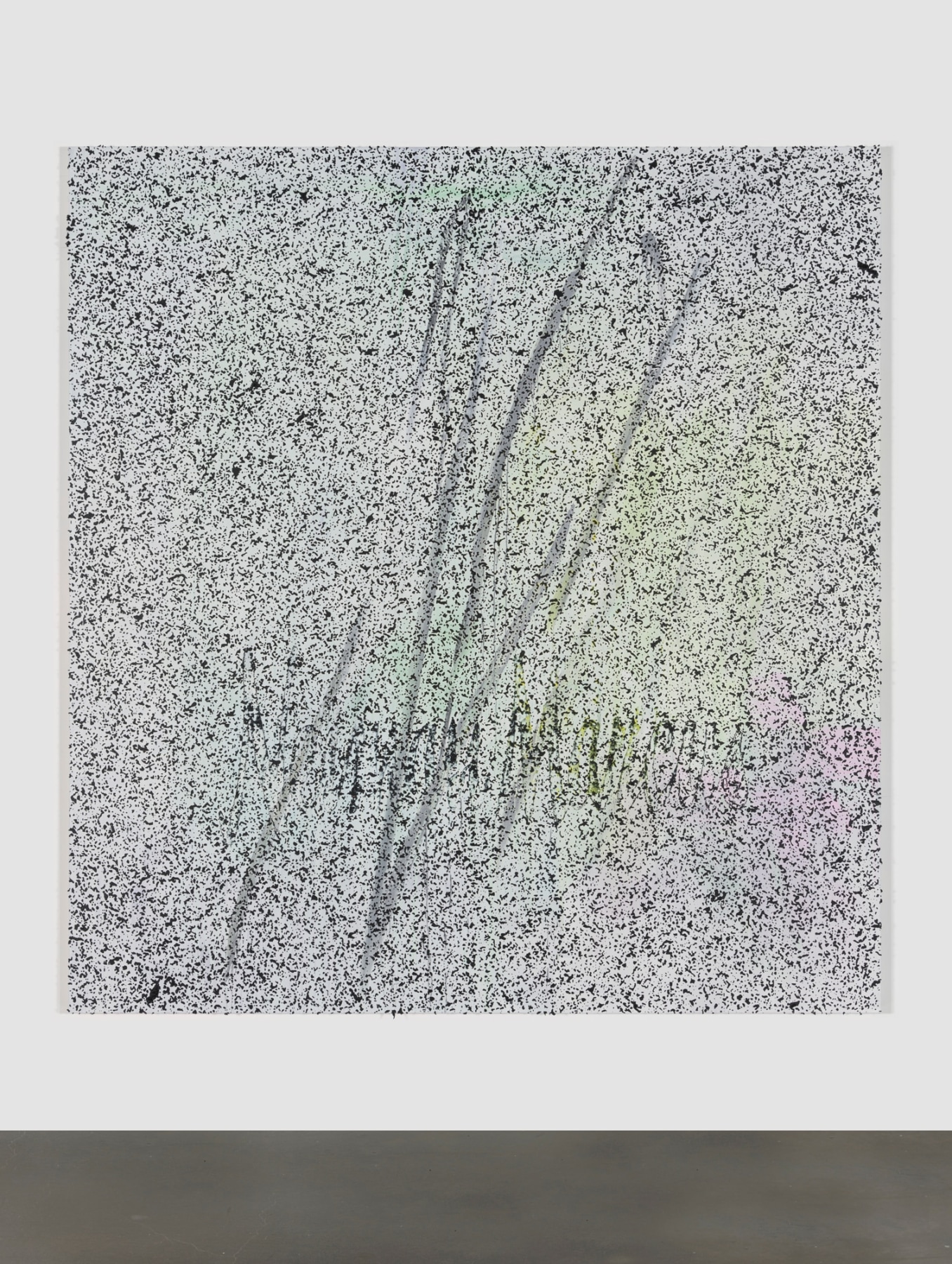
Jacqueline Humphries
Neiman Marcus, 2020
Oil on linen
96 x 90 inches (243.8 x 228.6 cm)
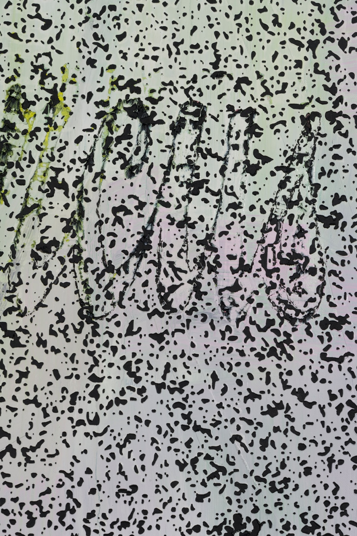
Jacqueline Humphries integrates gestural abstraction with the effects of new technologies, exploring how painting can capture and complicate the sensory experience of a screen-based world. Neiman Marcus comes from a new body of work anchored in a digitally-enlarged image of white noise––a visual realization of both randomness and constancy, and a trope of television culture and video art of the 1960s and ’70s. Humphries used this image to create a stencil through which she pushed paint onto a primed canvas, juxtaposing traditional brushwork and mechanical application, the larger shapes and the allover pattern. The brand name “Neiman Marcus” in its iconic cursive font––itself evoking both freehand calligraphy and mechanical reproduction––simultaneously emerges from and dissolves into the field of raised black speckles that depict white noise. A luxury retailer in operation for over 100 years, Neiman Marcus’s name remains instantly recognizable yet on the verge of disappearance, its visual instability pointing to the company’s recent hardships. Slashing gray lines span the length of the canvas, coalescing into a signature form seen elsewhere in Humphries’s practice. The lines’ passing resemblance to the department store logo offers sly commentary on personal branding, while evading any direct conflation of artistic and corporate identities.

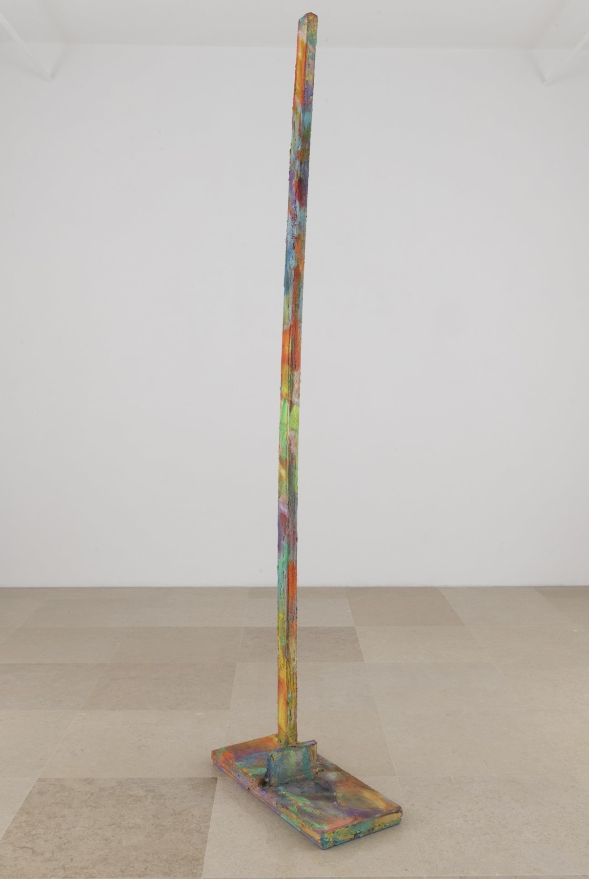
Rachel Harrison
Next Stud, 2020
Wood, cement, acrylic, enamel
101 x 27 1/2 x 12 inches (256.5 x 69.9 x 30.5 cm)
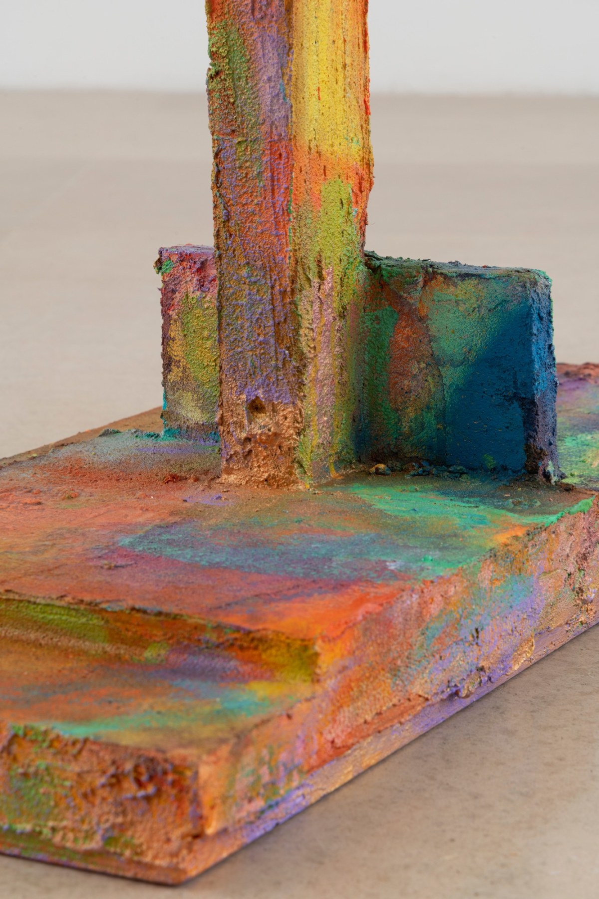
Rachel Harrison’s Studs sculptures, a series she began in 2015, are made from warped wooden studs the artist finds in hardware stores and lumberyards. These studs are traditionally used to frame walls but, due to their misshapen form, have become void of function. Each of Harrison’s sculptures presents a single defective stud isolated and upright on a constructed base, then coated in cement and painted with bold strokes of vibrant color.
Next Stud’s verticality recalls the standing figures of Alberto Giacometti or Louise Bourgeois’s totem-like forms, and its near-human scale also channels the discourse of anthropomorphism in Minimal sculpture. Harrison’s engagement with art history extends to the work’s surface treatment: her energetic handling and visible brushwork summon midcentury narratives of action painting, and her palette of high-key oranges, greens, blues and purples is almost Fauvist in its embrace of the color spectrum. Harrison’s Studs also point outward to implicate the architecture that surrounds them, drawing attention to the walls that frame and contain works of art. She highlights the studs’ intended infrastructural role in creating conditions of viewing, and recasts them as monuments to the human endeavor to construct and shape our environment.

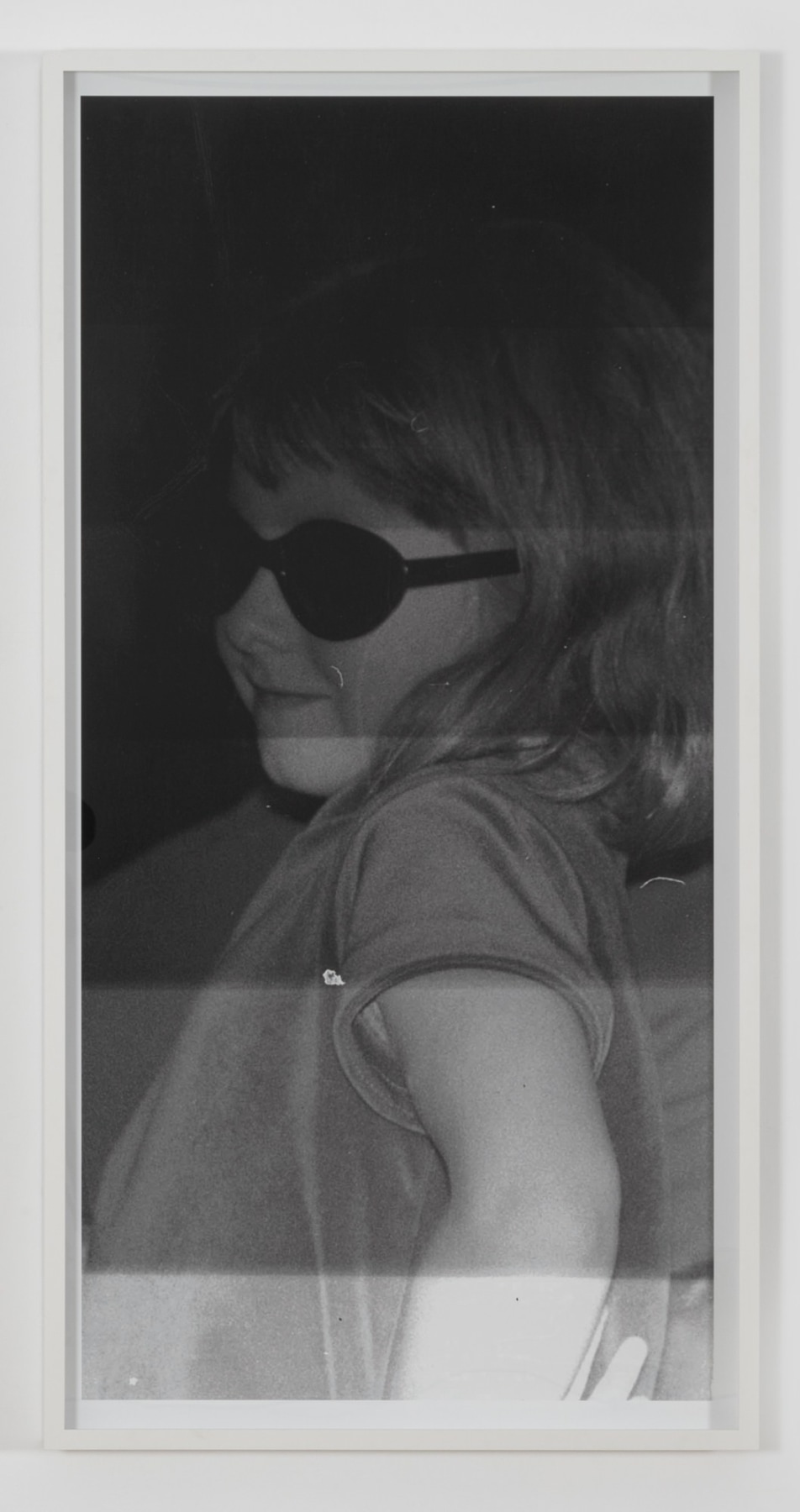
Lutz Bacher
Girl with Sunglasses, 2013
Pigment print
Frame: 68 1/4 x 34 1/2 x 3 inches (173.4 x 87.6 x 7.6 cm)
Lutz Bacher’s genre-defying practice put strategies of appropriation toward evocative ends, restaging found photographs, common objects, and mass media imagery to render meaning thrillingly unfixed. Girl with Sunglasses recycles a discarded snapshot from an unknown source, which Bacher has framed and enlarged to print the image of a child at near-adult proportions. The streakiness of the print (under-exposed at the top, washed out at the bottom) attests to her committedly lo-fi aesthetic, with a penchant for what Martin Herbert calls “glitch-laden, raw photography…mixing signal and noise.” Girl with Sunglasses further impedes legibility through its subject’s occluded gaze, critically intervening in portraiture’s well-worn dynamics of seeing and being seen. The photograph alludes to Bacher’s keen interest in the shadow side of celebrity, its kid protagonist wearing the same dark lenses that public figures use to hide in full view. The girl’s veiled identity also resonates with Bacher’s own persona as something of an art-world cipher: she used a pseudonym and rarely gave interviews, letting her cryptic found imagery speak for itself.

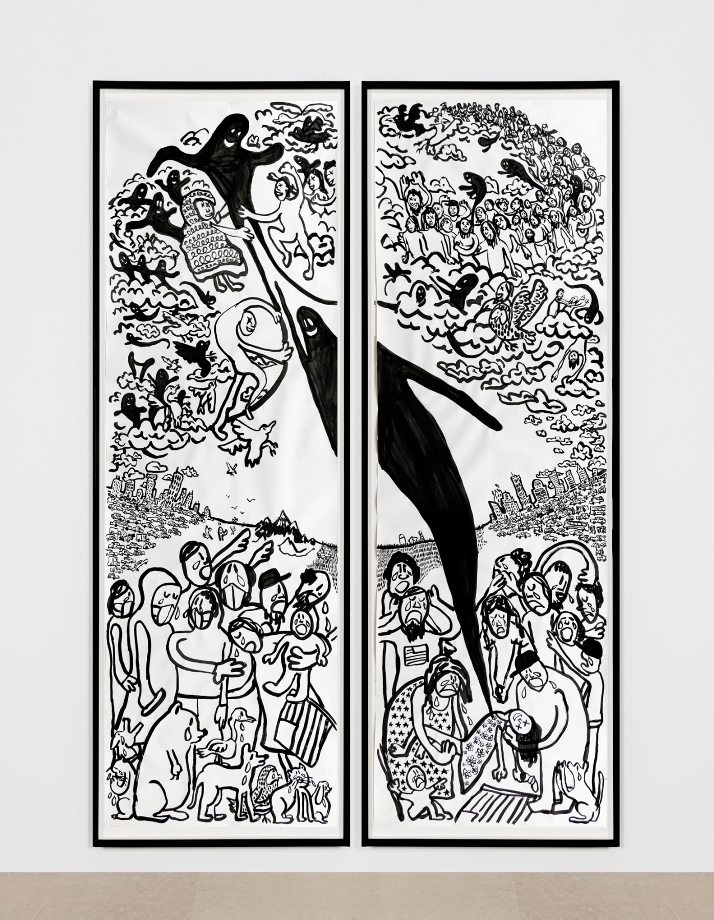
Paul Chan
Spekulieren (to speculate), 2020
Ink on paper
Paper: 150 x 48 inches (381 x 243.8 cm) each
Frames: 155 x 53 x 3 inches (393.7 x 134.6 x 7.6 cm) each
Paul Chan’s latest suite of drawings are titled after entries in a 1925 children’s dictionary by Ludwig Wittgenstein, written after the eminent philosopher abandoned his chair at Cambridge to teach elementary school in rural Austria. Chan made these Word Book drawings with ink and brush using his left (non-dominant) hand, and that lightness of touch produces the buoyant, animated forms that serve as vessels for weightier themes.
Spekulieren (to speculate) is the largest and most complex of these Word Book drawings, and its two-paneled structure and arched format recall Medieval altarpieces or stained-glass windows. Chan also drew inspiration from sixteenth-century religious paintings by El Greco, and Spekulieren restages the scene of the Assumption of the Virgin for our own troubled times. Two weeping mourners in the lower left corner cradle a dead girl in their arms, her departing soul rendered as a sinuous, smiling black shape that diagonally spans the drawing, connecting its separate sheets and linking the heavenly chorus above to the suffering below. Chan executed this work in 2020 and it registers the year’s anxieties: several figures in the crowded foreground wear masks, and even their pets are crying.

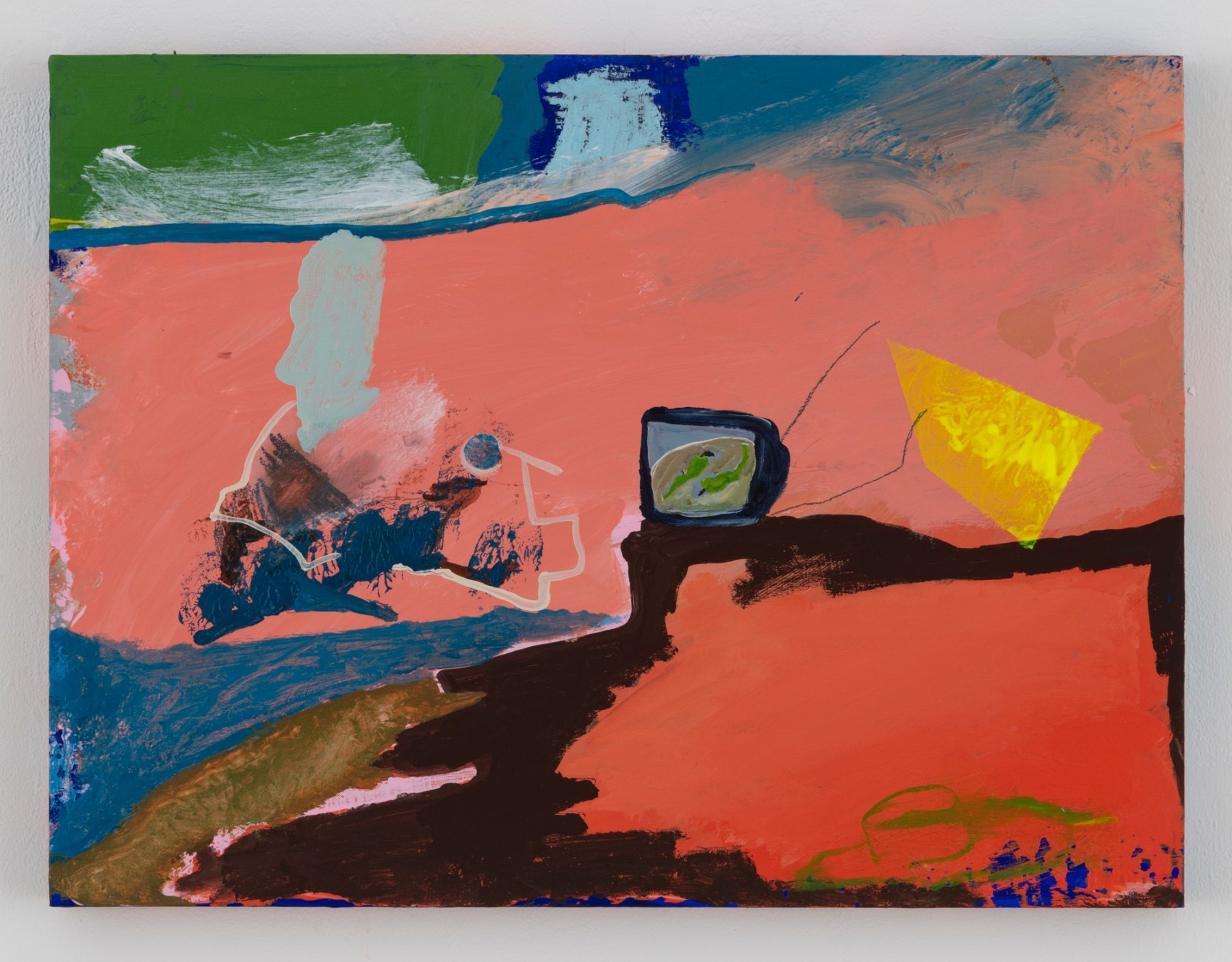
Walter Price
Ground cherries, 2019
Acrylic, gesso, and flashe on wood
18 1/8 x 24 x 1 3/4 inches (46 x 61 x 4.4 cm)
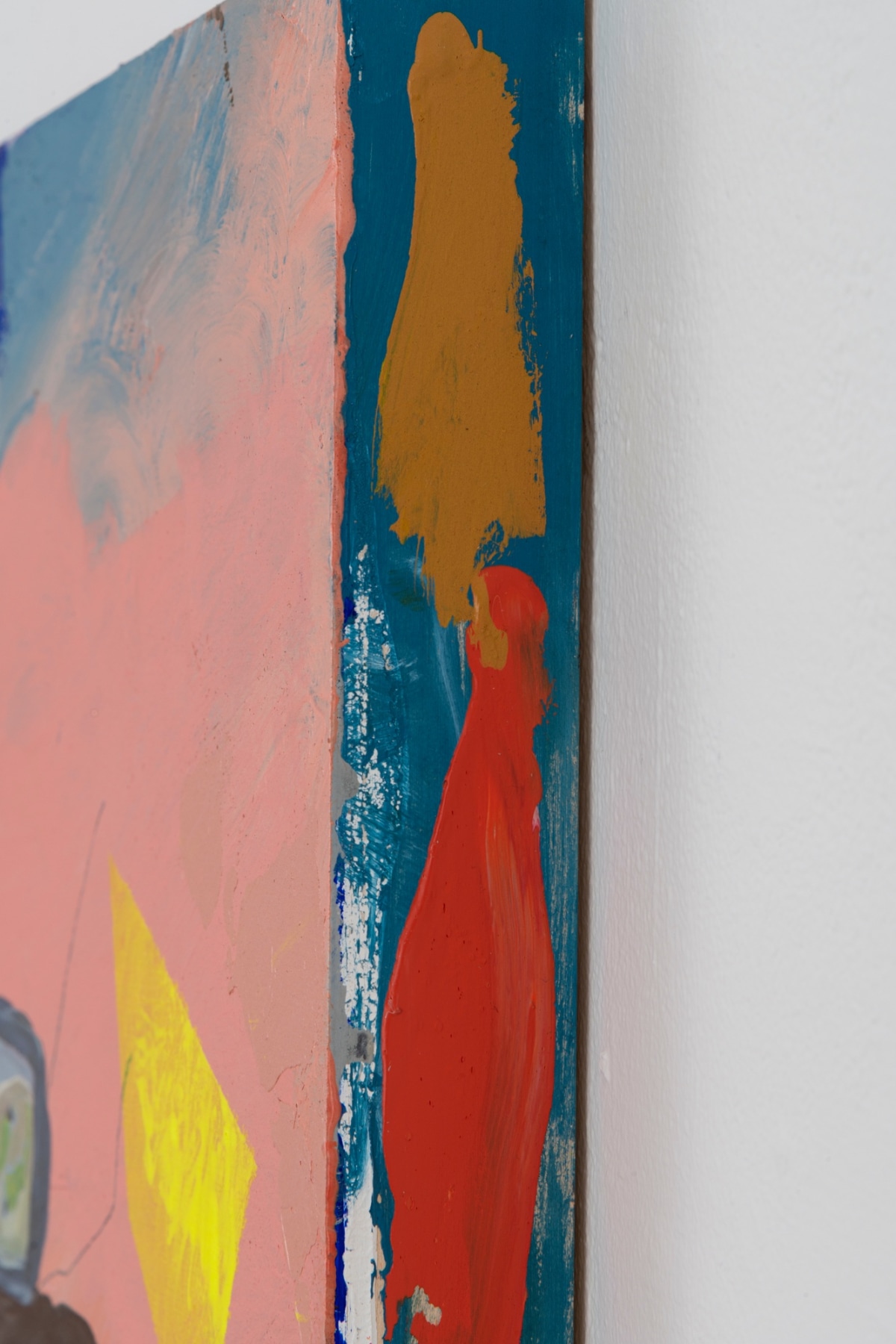
Walter Price's paintings and drawings tread the line between figuration and abstraction, creating interior worlds that hover on the brink of legibility. His fluid compositions form dynamic grounds for both stray marks and recognizable things: an old-school TV monitor, for instance, or a sketchily-rendered hat (a signature motif) of uncertain origin—part sombrero, part ten-gallon, part Hasidic biber. Price is known for his lush palette, or what Darby English calls “his penchant for punchy color: weighted with value and density, it approaches in sheets or lands with a thud...and it is potent exactly because it talks more to the body and imagination than to the head.” The work’s title, Ground cherries, riffs on the Korean word for the shishito peppers that appear on the TV screen, demonstrating an interest in translatability between languages, across media, and from verbal to visual representation.

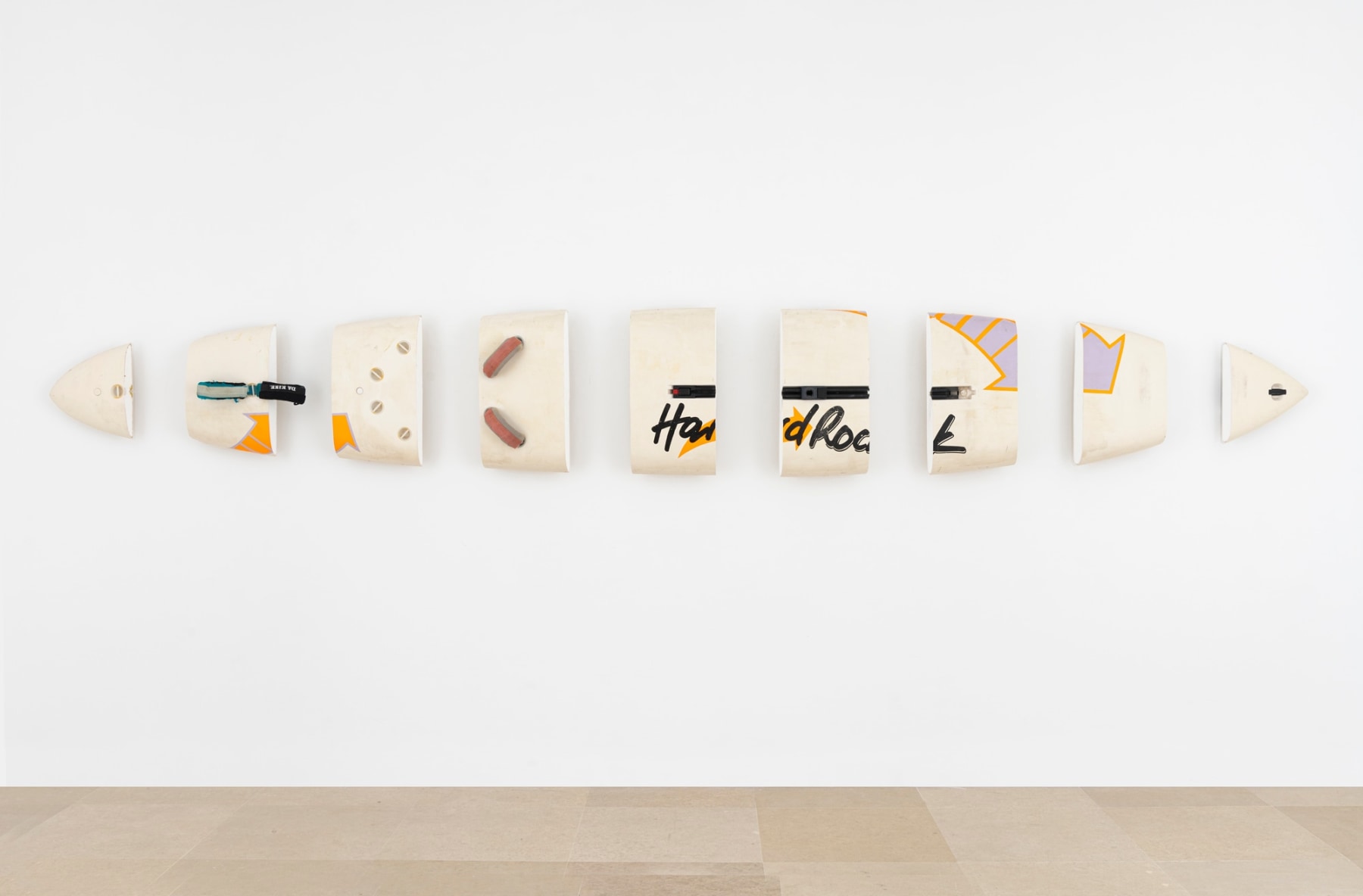
Michael Krebber
Hard Rock, 2008
Windsurfing board, wall mounts
24 1/2 x 183 inches (62.23 x 464.82 cm)
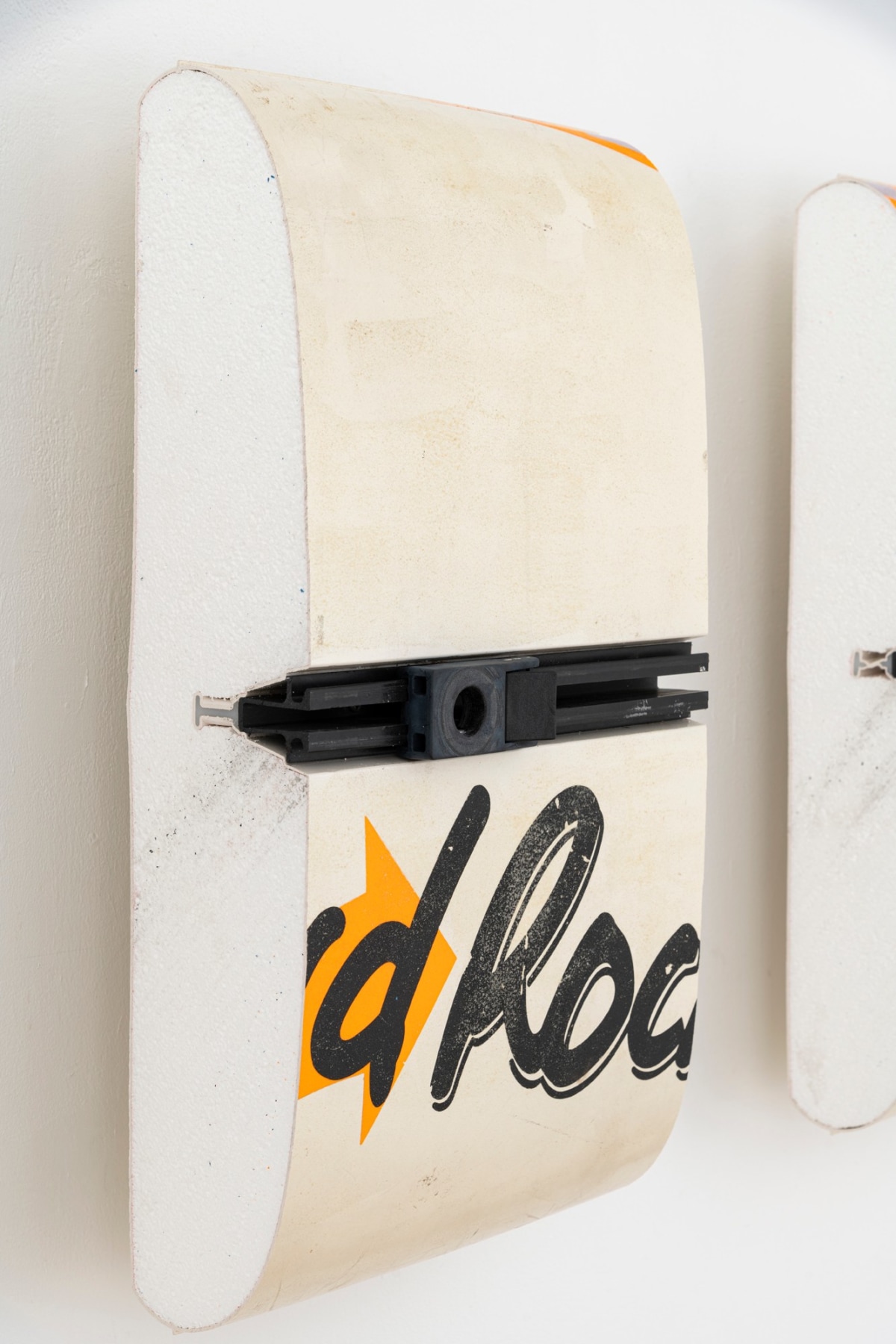
Michael Krebber’s painting practice strains the medium’s outer limits, recalibrating our standards for what a painting can be when all its known elements are stripped away. Hard Rock belongs to a 2008 series of reliefs made from cut-up windsurfing boards—found objects that Krebber has “carved in slices like tunafish and hung on the wall like Donald Judd sculptures.” The boards’ neat progression of modular units does evoke Minimalist seriality and uniform stacks, but also recalls that, while Judd’s work looks more like sculpture, he considered it nearer to painting.
Krebber’s surfboards likewise function as surrogate paintings with artistic gesture reduced to a simple partitioning. The brightly-hued, branded objects are relieved of their lifestyle function when severed and mounted on the wall, made to occupy the space of painting even when no paint has been applied. Krebber’s rigorous dismantling of painterly norms is often taken as a sign of refusal or evasion, yet Hard Rock demonstrates that an exacting critique of painting need not be austere. The surfboards’ loud colors and distinctive lozenge shapes invite a certain formal delectation, and the artist has said he finds them “one of the most beautiful images in the world.”

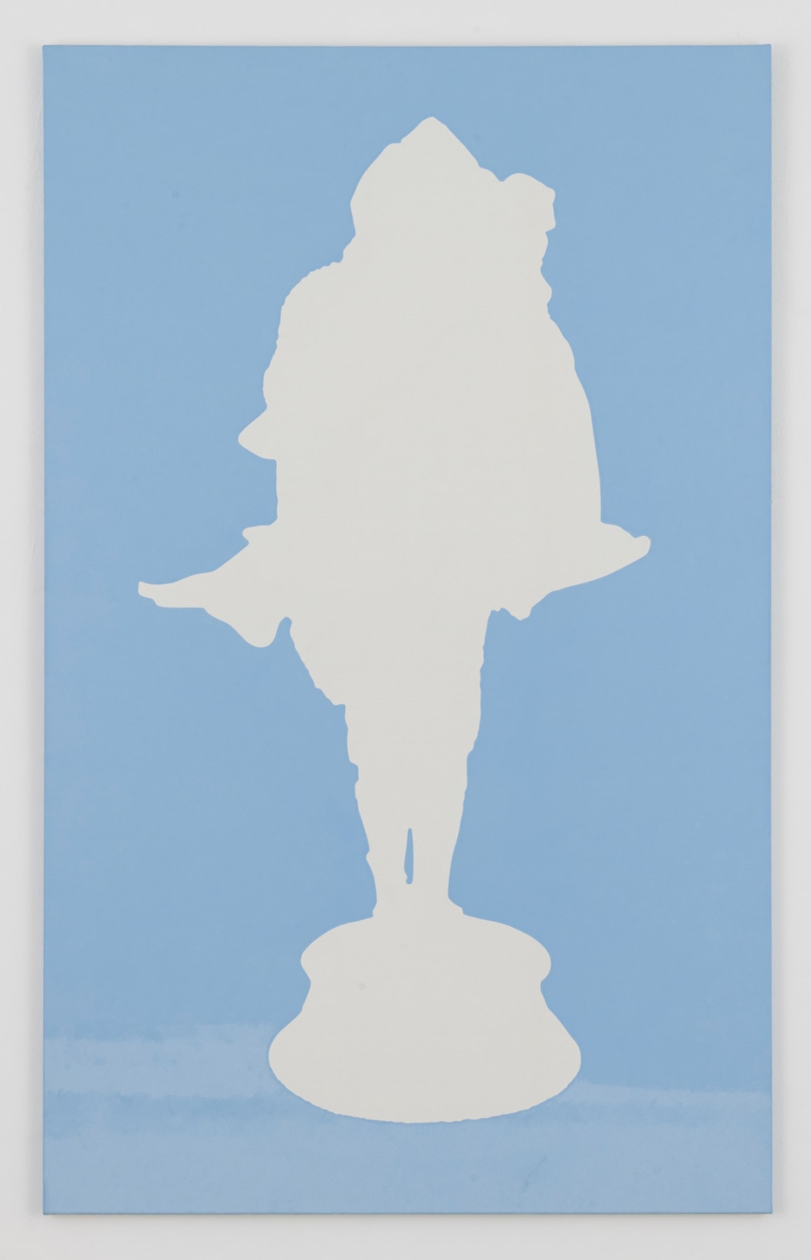
Daan van Golden
Celuy Qui Fut Pris III/IV, 2010
Oil on canvas
78 3/4 x 49 1/4 inches (125.1 x 200 cm)
Daan van Golden's Celui Qui Fut Pris III/IV belongs to his series of bicolored silhouettes: paintings that merge pared-down Conceptualism and Pop sensibility to form crisply executed, striking shapes. Here, the Dutch artist outlines a Chivalric bronze sculpture by François-André Clemencin in stark white against a blue background. Reduced to pure contour, the strangeness of Clemencin’s composition—in which a knight in full armor carries his beloved, naked and resting upon his upturned shield—is distilled and exaggerated in van Golden’s two-dimensional rendering. Working from a photograph of the statue, he translates its gestalt onto four separate canvases to produce unique iterations of the same composition: each a slightly different copy derived from a single source. Van Golden thus subsumes the effects of mechanical reproduction into his meticulously hand-painted outlines. His silhouettes draw on legacies of appropriation and nudge that discourse in new directions, both faithfully depicting a photographed object and abstracting it beyond recognition.

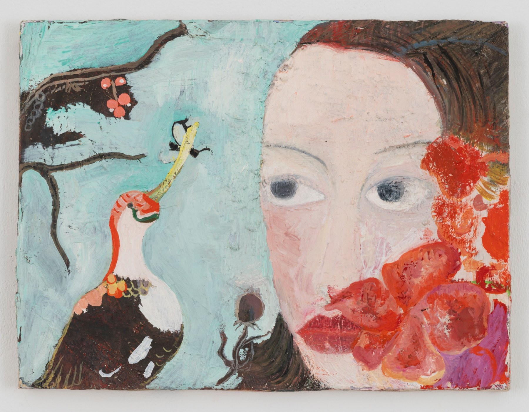
Katharina Wulff
Personnage, 1999
Oil on canvas
12 x 15 3/4 inches (30.5 x 40 cm)
Katharina Wulff creates ambiguously narrative canvases that foreground female agency and consciousness. The woman pictured in Personnage is solid and durable in pose and placid in expression, as she observes a small winged insect caught in a bird’s curving beak. The composition occupies a shallow, dream-like space offset by the dense materiality of Wulff’s impasto, which imparts a drily textured surface to the mannered, mysterious scene.
One of the leading figures to emerge from Berlin in the 1990s, Wulff came of age alongside peers like Kai Althoff and Lukas Duwenhögger, and her intimately scaled canvases continue that German figurative tradition that combines fragile beauty with the grotesque. Symbolist elements like rogue hibiscus flowers further distinguish Personnage from traditional portraiture, recalling the Surrealist-inflected tableaux of Leonora Carrington or Florine Stettheimer. Wulff seeds the painting with narrative elements yet shies away from linear storytelling, opening onto a wayward, otherworldly realm governed by its own psychic and formal logic.

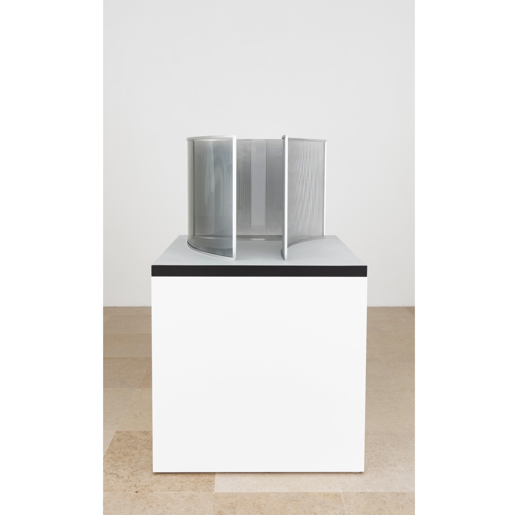
Dan Graham
Project for MOMA, 2009
Architectural model, two-way mirror glass, aluminum, acrylic, MDF
28 x 42 1/8 x 42 1/8 inches (71.1 x 107 x 107 cm)
Edition of 3
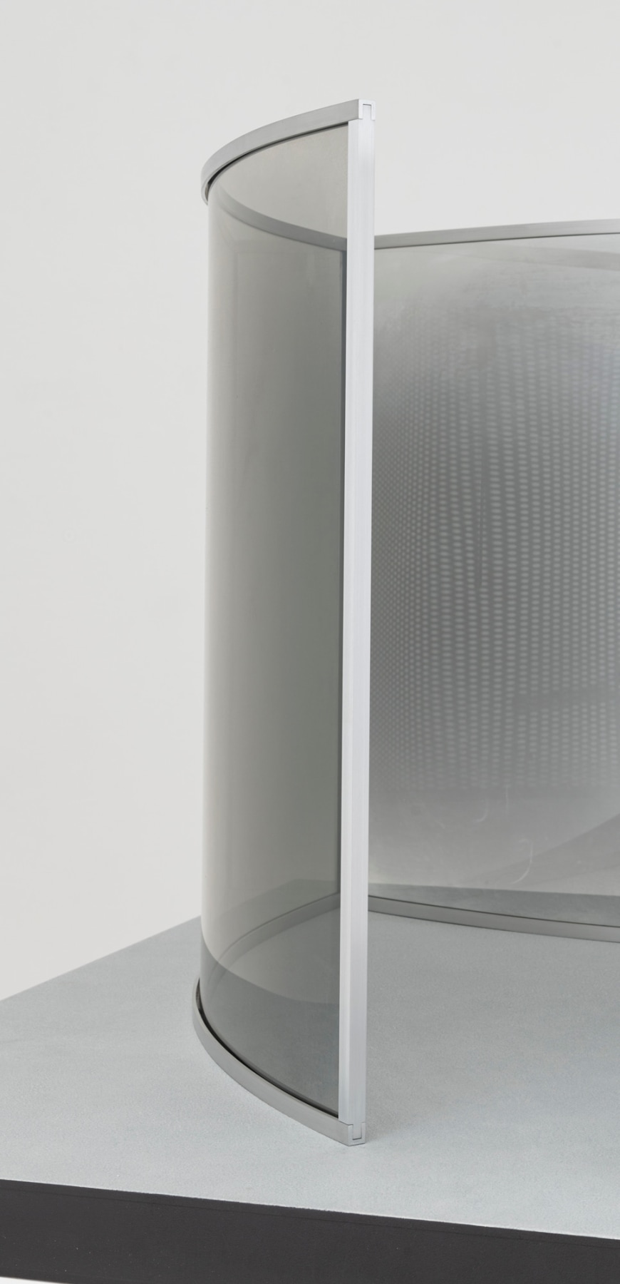
Since the 1980s, Dan Graham’s pavilions have rigorously examined how architectural spaces shape human behavior. Project for MOMA is an early three-dimensional study for Child’s Play, the artist’s 2015-16 installation for the sculpture garden at the Museum of Modern Art. The maquette offers a scaled-down version of that work’s immersive physical experience. Graham constructs a triangular room and then skews its geometries, warping the sides and opening one vertex. Two exterior walls are made of semi-reflective glass and the third is perforated with tiny holes. Within, he creates a refractory landscape that shifts with each pass of the viewer’s eye. Graham juxtaposes these funhouse optical effects with the sleek anonymity of corporate and public buildings. Coming of age in the 1960s, the artist proceeds from the legacy of his Minimalist peers such as Donald Judd or Larry Bell. Yet Graham was always more invested in the social resonance of their blank, slickly executed forms: his signature use of two-way mirror glass recalls its role in market research settings and interrogation rooms. “My pavilions derive their meaning from the people who look at themselves and others, and who are being looked at,” Graham has said. “Without people in them, they might look a bit like minimal-art sculptures, but that's not what they're meant to be.”

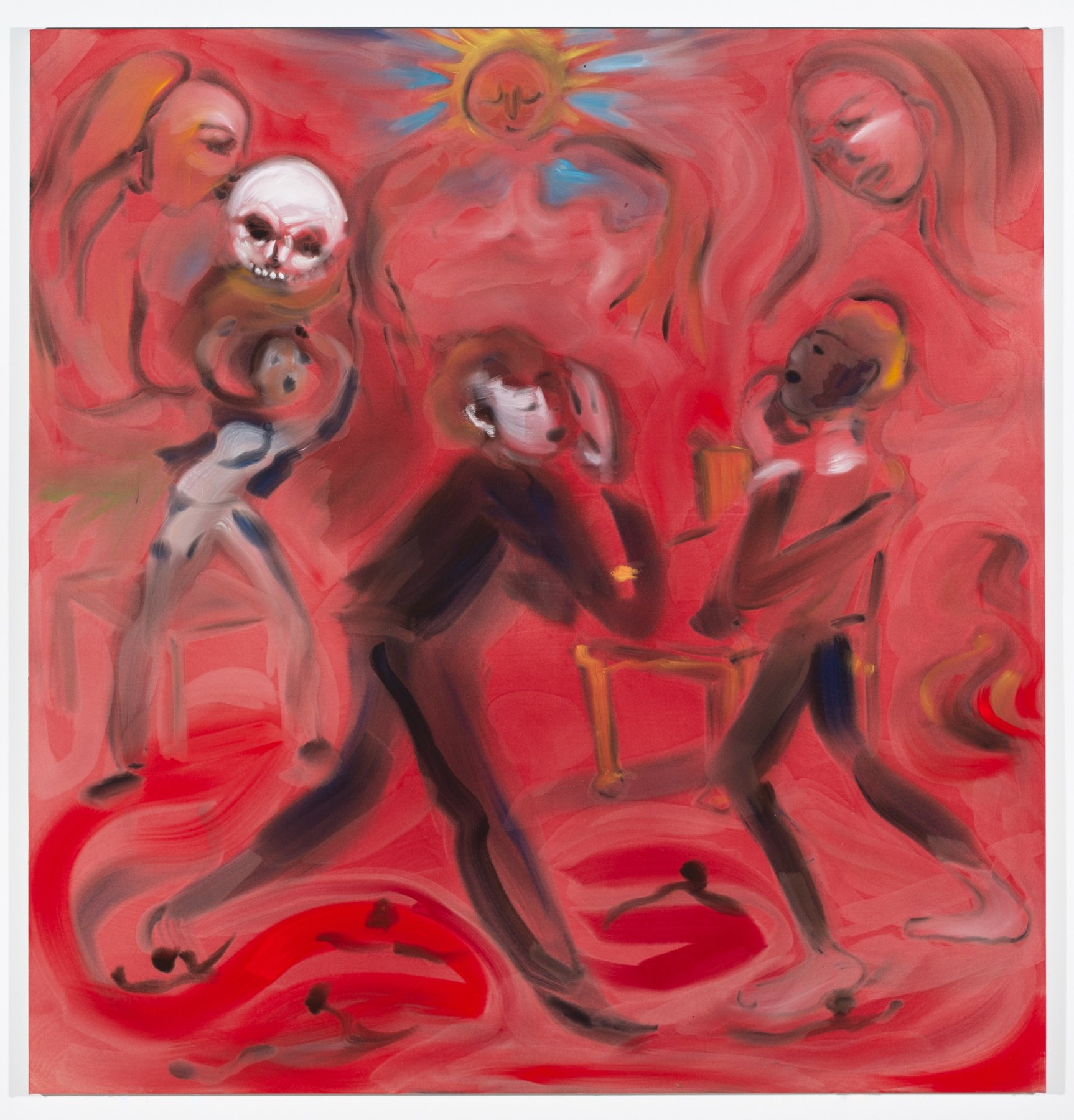
Sophie von Hellermann
The Red Room, 2020
Acrylic on canvas
78 3/4 x 74 7/8 inches (200 x 190 cm)
For two decades, painter Sophie von Hellermann has conjured large-scale, imaginative scenes with a vivacity all her own. Depicting literature, history, idiomatic expressions and moments of pure invention, von Hellermann animates her complex narratives with whorls of thinned paint on unprimed canvas. Her latest work, The Red Room, is titled after a nineteenth-century society novel by August Strindberg, with further visual echoes of Matisse’s famed Red Studio. Von Hellermann’s signature large, loose brushstrokes seem to radiate from the sun at the top of the painting, lending the composition a roiling energy that swirls and eddies but never resolves. The color red is almost personified here, treated like another character in von Hellermann’s beguiling drama. “Pigments scattered in water and acrylic binder mix; they carry all the information I need to convey an idea,” she has said. “The colors are the actors of my play.”


Rachel Harrison
Next Stud, 2020
Wood, cement, acrylic, enamel
101 x 27 1/2 x 12 inches (256.5 x 69.9 x 30.5 cm)

Lutz Bacher
Girl with Sunglasses, 2013
Pigment print
Frame: 68 1/4 x 34 1/2 x 3 inches (173.4 x 87.6 x 7.6 cm)

Paul Chan
Spekulieren (to speculate), 2020
Ink on paper
Paper: 150 x 48 inches (381 x 243.8 cm) each
Frames: 155 x 53 x 3 inches (393.7 x 134.6 x 7.6 cm) each

Walter Price
Ground cherries, 2019
Acrylic, gesso, and flashe on wood
18 1/8 x 24 x 1 3/4 inches (46 x 61 x 4.4 cm)

Michael Krebber
Hard Rock, 2008
Windsurfing board, wall mounts
24 1/2 x 183 inches (62.23 x 464.82 cm)

Daan van Golden
Celuy Qui Fut Pris III/IV, 2010
Oil on canvas
78 3/4 x 49 1/4 inches (125.1 x 200 cm)


Dan Graham
Project for MOMA, 2009
Architectural model, Two way mirror glass, aluminum, acrylic, MDF
28 x 42 1/8 x 42 1/8 inches (71.1 x 107 x 107 cm)
Edition of 3

Sophie von Hellermann
The Red Room, 2020
Acrylic on canvas
78 3/4 x 74 7/8 inches (200 x 190 cm)